The historical context in which works of art are produced sure affects their meaning. Not all posters have commercial intentions yet “the majority of commercial artists from the turn of the century until fairly recently […] were engaged in the service of advertising of one kind or another”.[1] Some artists designed posters in favor of the government while others tried to sell a product or show that design could simply be a way of comforting the audience through specific visuals and technologies. Some of the latter used in the Avant-Garde works were later employed as tools to attract people in advertising posters. Commercial design uses radical style but not for radical ends, destroying the meaning of the visuals yet keeping their form.
Starting in the 1920s, right after the end of the First World War, a variety of graphic designers in Britain, France and the US were getting inspired from modern painting movements such as cubism, futurism and purism. What is quite noticeable is the use of a sort of reductive geometric abstraction, especially in purism, that designers such as A.M Cassandre employed in their works. The latter decided however to integrate commercial design with these painting styles of the pre-war years. “A.M Cassandre took the ideas of Modernist pioneers into powerful commercial works, which have become among the most treasured commercial graphics of all time”.[2]
Adolphe Jean-Marie Mouron, known as A.M Cassandre, is a very well known Ukrainian-French Art Deco graphic designer in Paris. He designed the famous poster Restaurez-vous au Wagon-Bar in 1932. This poster was most certainly considered as part of Art Deco because of its geometric abstraction. Art Deco is actually a gradual process by which modern art styles such as cubism, futurism and purism were used to address a broad public. These modern art styles had one philosophy in common: a new utopian age of harmony. The war was a great disaster; therefore most artistic movements were looking forward to a more harmonious future for Europe.
Purists had in mind that their “new spirit” would serve as a template for a new society. They were inspired by Cubists and are in favor of universal harmony. They think that after the war, the society should be exposed to comforting work. “It seems natural that a traumatized continent would be ripe for the Purists’ Neoplatonist message”.[3] The poster Restaurez-vous au Wagon-Bar is a colored lithograph, which is a method of printing invented in 1976, using a stone or a metal plate with a completely smooth surface.
Cassandre’s objective here is to commercially advertise a café on the French railways. It is obvious that Cassandre uses abstract geometrical forms. The architectonic structures and delineated forms clearly indicate the influence of the Purist movement. They are also clear in the way the flat and polished forms stand out like the skyline of a city. The smooth and pure surfaces of the bottles and glass of wine in the poster are comparable with Amedee Ozenfant’s painting, Guitar and Bottles. Cassandre portrays contemporary machine idealism, visible in the abstract geometric shapes and smooth surfaces. The bottles and glasses used here to make reference to the café are covering the bulky image of the train’s undercarriage. There is a bulky and bold feel to the poster but at the same time, the smooth surfaces gives it a touch of finesse. Some objects are overlaying other objects, which could evoke the collages used in Cubists’ works. Cassandre’s use of type possibly refers to the black rail. The bold words “Wagon-Bar” as well as the whole mass of the train’s undercarriage give us a feel to machinery, metal objects, train railways and other heavy objects. There is a contrast in the typographic style itself because Cassandre combines a bold, heavy typeface with a light, tilted, handwriting-like typeface that says “consommations – petits repas” which indicates the bigger contrast between the glasses (or bottles), and the train’s carriage. Cassandre uses a very light, sans-serif typeface at the top and right corner of the poster as a contour, that says something about the French railways. This poster clearly shows inspiration form previous movements that did not really have promotional or commercial intentions. It destroys the original meaning of the use of such visuals however keeps their form. Another famous Suprematist artist, El Lissitzky, transforms one of his previous works into a commercial poster practically using the same visuals.
In the period after the First World War, there were two major developments that were introduced, one of them being the Dutch De Stijl and the other the Russian Constructivism. The name “Suprematism” was born after Kasimir Malevich, a Russian painter and a pioneer of geometric abstract art, who named his work in reference to “the supremacy of pure feeling in creative art” [4] indicating that abstract forms could convey powerful emotions. A number of artists assembled in Russia hoping that they could play a role in building the new communist state. Avant-Garde artists often speculated a new, more enlightened age and the fact that social change was necessary. Moreover, they believed that they had a chance to construct a new utopian society that would improve the economy and social equality in the world.
El Lissitzky was part of the Suprematist artists dedicated to the Bolshevik cause however had his own way of expressing abstraction based on Suprematist principles adding three-dimensional elements, rotation and even some realistic rendering. He believed in the use of geometrical abstract forms because he thought that both intellectuals as well as illiterate people could understand the main focus of the poster. An article written by El Lissitzky and Mart Stam mentions “Everything that is unimportant or beside the point, should be omitted. Nothing should be there for aesthetic reasons as it will do nothing but harm. It is of prime importance that the product itself should be shown, not merely its name”.[5] Little by little, El Lissitzky collaborated with the constructivists who rejected self-expressionism and committed their work to industrial materials, which met the goals of the new government. He designed a poster to advertise the Pelican Ink Company. We can notice the use of a solid color, yellow, for the background and a simple white circle in the middle in which we have the type “Drawing Ink” and a hand carrying the bottle of ink as well as a compass. The word Pelican starts in the circle and continues on the yellow background. The fact that El Lissitzky actually borrows a motif from Russian Constructivism, which is the hand, and erases the political and revolutionary ideology of it, stands out the most. El Lissitzky had a photograph of a hand in his previous constructivist work The Constructor, which shows “the artist being an engineer”.[6] In this poster however he uses this same element to present the product. The hand is transformed from a hand of a revolutionary artist to that of a consumer. This poster is a colored lithograph and is a hand-drawn illustration as opposed to having a photogram that uses sophisticated photographic techniques. The original had featured the artist’s commanding eye, which has here been replaced by a bottle of ink. The eye also featured in Alexander Rodchenko’s Kino Glaz (Cine Eye), which referred to the lens of a camera, was often used in constructivists’ works. Moreover, “the cuff on the arm in the advertisement has also been changed from something plain into the French cuffs, complete with cufflinks, of a well-manicured member of the bourgeoisie”.[7]
This poster has commercial intentions whereas The Constructor poster adopts the Constructivist theme, which included the desire to make works that served a practical purpose within the context of the communist cause. The central role of art formulated by the constructivists was a complement to the new workers’ state. El Lissitzky uses the constructivists’ style but not for the same objectives. He drains the visual elements from their real meaning, yet keeps the same style.
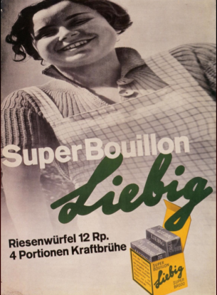
During the post-war period, emerged a new style in graphic design called the Swiss Style, which led to the appearance of the International Typographic Style (International Style). The latter also parallels with the development of corporate identity, where graphic designers create logos and give a specific identity to each company. During that period, more and more works from the politically engaged movements such as Russian Contructivism, De Stijl, Bauhaus and more were transformed into commercial works. The visuals stayed the same however the works of art were cleared out from their original meanings and contexts. The International Style developed the idea of graphic design serving as a functional solution to a problem such as creating a company’s own identity. The visual elements of Constructivist design were used for different purposes. A famous example of that would be the poster designed by Hans Neuburg, Liebig Super Bouillon. This poster designed in 1935, is an advertisement for bouillon cubes. It is a typophoto, which is the combination of type and photography to produce a work. It resembles the photomontages that were done previously during the Constructivism movement such as Alexander Rodchenko’s poster Kino Glaz. During this period however, Swiss Style poster designers used a lot of hand-drawn elements.
In this poster the image is angled and distorted: the woman appears as a cheerful figure seen from the eye level of a child. The black and white photograph of the woman covers three quarters of the poster then fades in with the background. The signature that was the basis of the logotype can be seen in the advertisement where the square is the layout’s stabilizing element. Also there is a sort of dynamism because of the tilted image taken from a low angle as well as the tilted sans serif letters. The type is laid out using different sans-serif typefaces. Neuburg was “firmly convinced that a product bought by housewives, could be presented in clean typography”.[8] The name of the brand itself looks like it was hand written with a marker and is tilted, which gives it a playful feel somehow. Also, it is partly covered by the catchphrase “Super Bouillon”, which in its turn overlaps the image of the yellow box that contains the cubes. The smiling image of the woman could be linked to one of El Lissitzky’s works, Russian Exhibition, for the exhibition of Russian applied arts. In this poster we can see the same visual, which is black and white photography that covers the background of the poster. Moreover, the photograph shows two young adults, male and female, smiling and looking away into a hopeful future. There are also different typefaces used scattered all over the poster. The black and white photographic element that was formerly used in order to promise a new utopia and a hopeful future is used in Neuburg’s poster to promote a certain product (the bouillon cubes). Neuburg’s poster is “a great example of an icon of utopian communist workers being transformed into smiling consumers in a capitalist society”.[9]
In conclusion, all three images discussed earlier try to advertise or promote something to the audience yet different technologies and mediums were used to produce them: two of them being colored lithographs and the third one a photomontage. What they have in common is their dynamism and the fact that their visuals were inspired by earlier works. Moving from Avant-Garde disruptive images to commercial, these posters use the same visuals however stripped out of their original historical meanings. Social changes affect the meaning of certain images or graphics and they certainly shape visual innovations.
[1] Lees-Maffei Grace and Houze Rebecca, The Design History Reader, (London: Berg Publishers, 2010), chap. 59.
[2] Blackwell Lewis, 20th Century Type, (London: Laurence King Publishing, 2004), 62.
[3] Stephen J. Eskilson, Graphic Design: A New History, (North America: Yale University Press, 2007), 162.
[4] Stephen J. Eskilson, Graphic Design: A New History, (North America: Yale University Press, 2007), 192.
[5] Hollis Richard, Swiss Graphic Design: The Origins and Growth of an International Style 1920-1965, (London: Laurence King Publishing, 2006), 56.
[6] Stephen J. Eskilson, Graphic Design: A New History, (North America: Yale University Press, 2007), 204.
[7] Stephen J. Eskilson, Graphic Design: A New History, (North America: Yale University Press, 2007), 205.
[8] Hollis Richard, Swiss Graphic Design: The Origins and Growth of an International Style 1920-1965, (London: Laurence King Publishing, 2006), 102.
[9] Stephen J. Eskilson, Graphic Design: A New History, (North America: Yale University Press, 2007), 293.
Bibliography
Eskilson, Stephen J. Graphic Design: A New History. North America: Yale University Press, 2007.
Grace, Lees-Maffei, and Houze Rebecca. The Design History Reader. London: Berg Publishers, 2010.
Lewis, Blackwell. 20th Century Type. London: Laurence King Publishing, 2004.
Richard, Hollis. Swiss Graphic Design: The Origins and Growth of an International Style 1920-1965. London: Laurence King Publishing, 2006.